- About TCB
- Sewing Machines for TCB
- TCB Crews Introduction
- News / Daily
- Shop / Stockists
- Repair & Hem
- Recruit
- Contact
![]()
![]()
![]()
![]()

2026/01/14
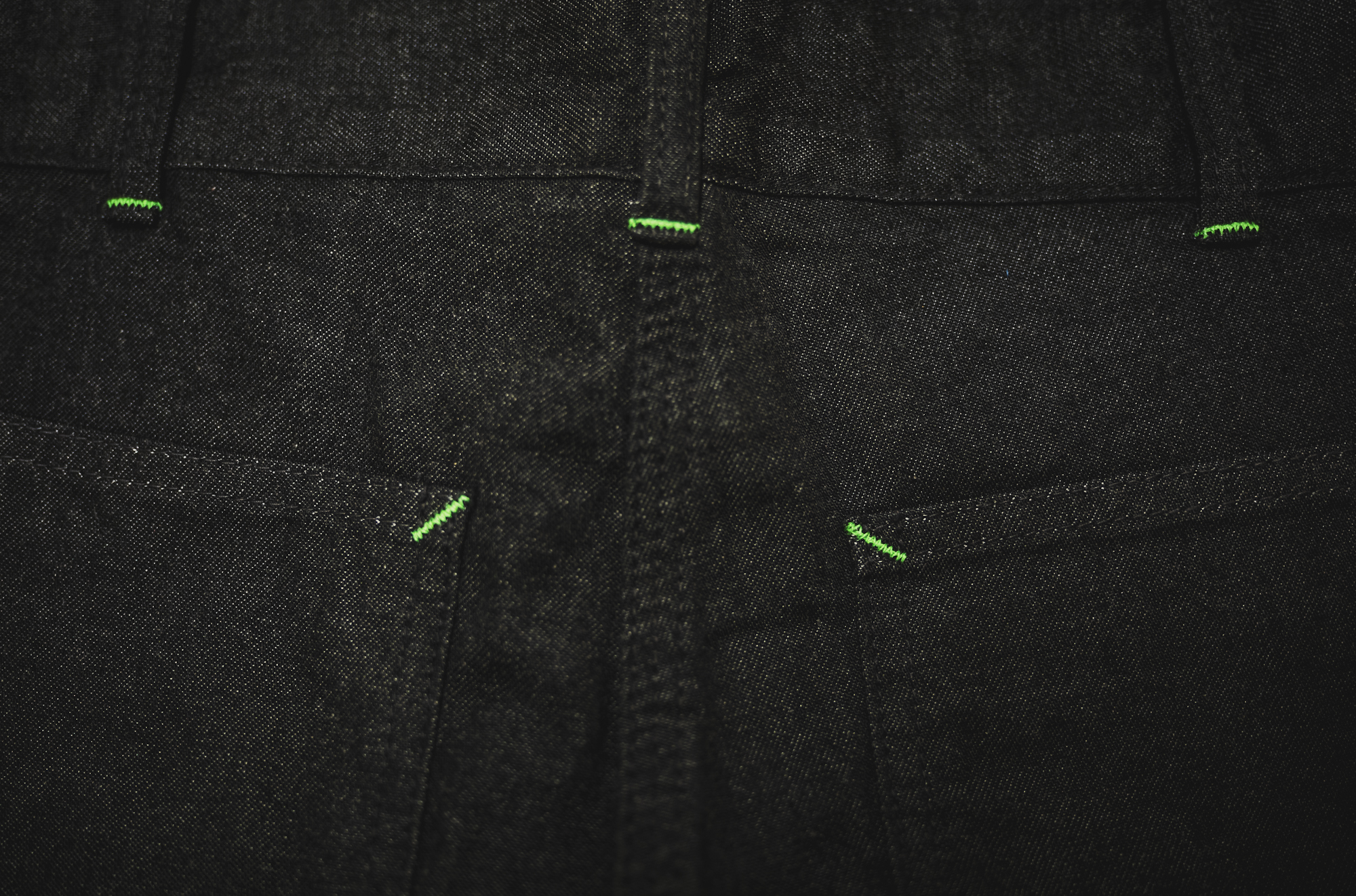
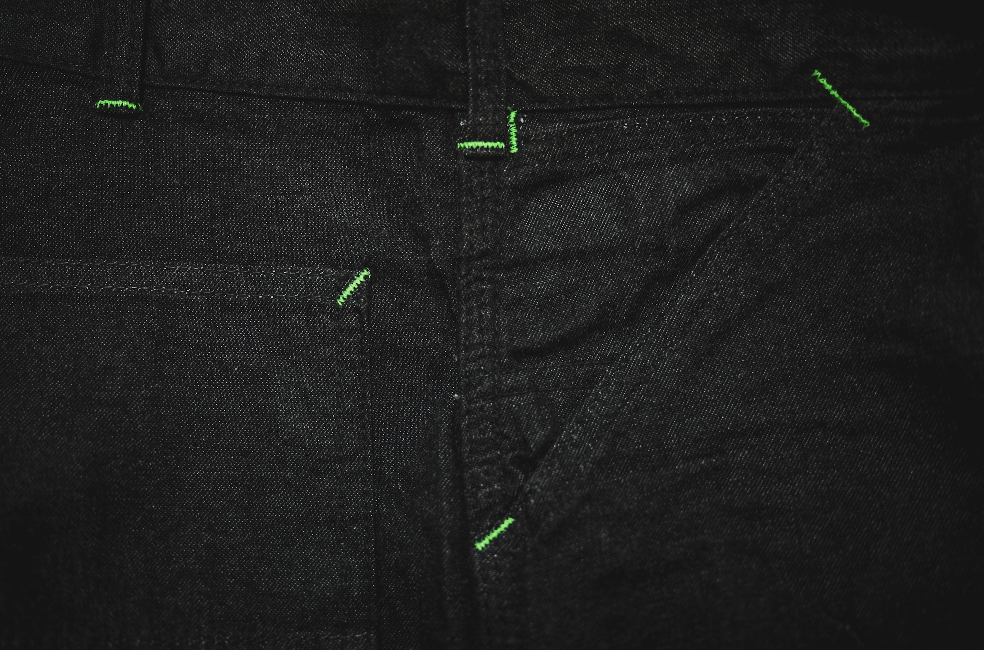
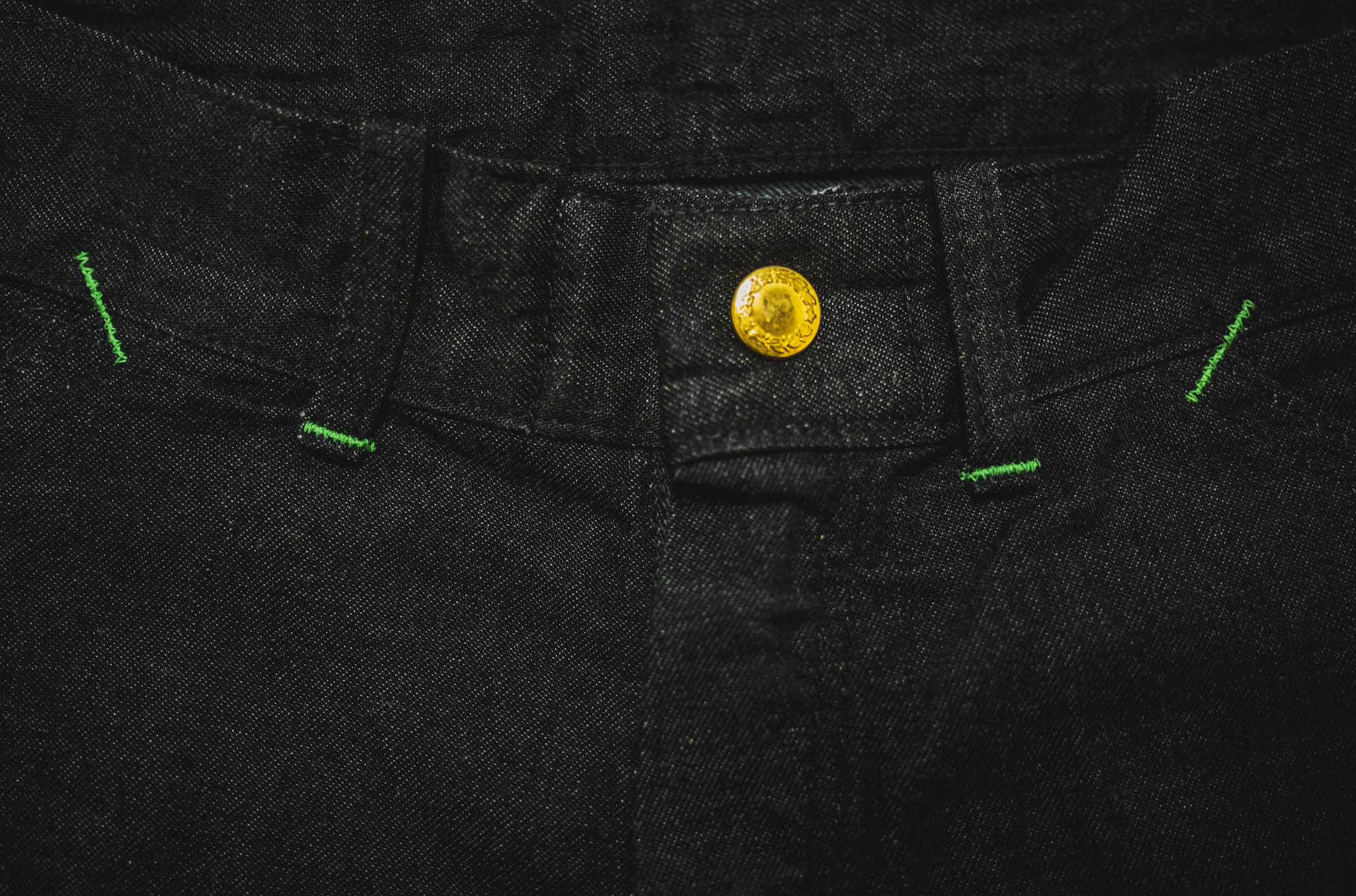
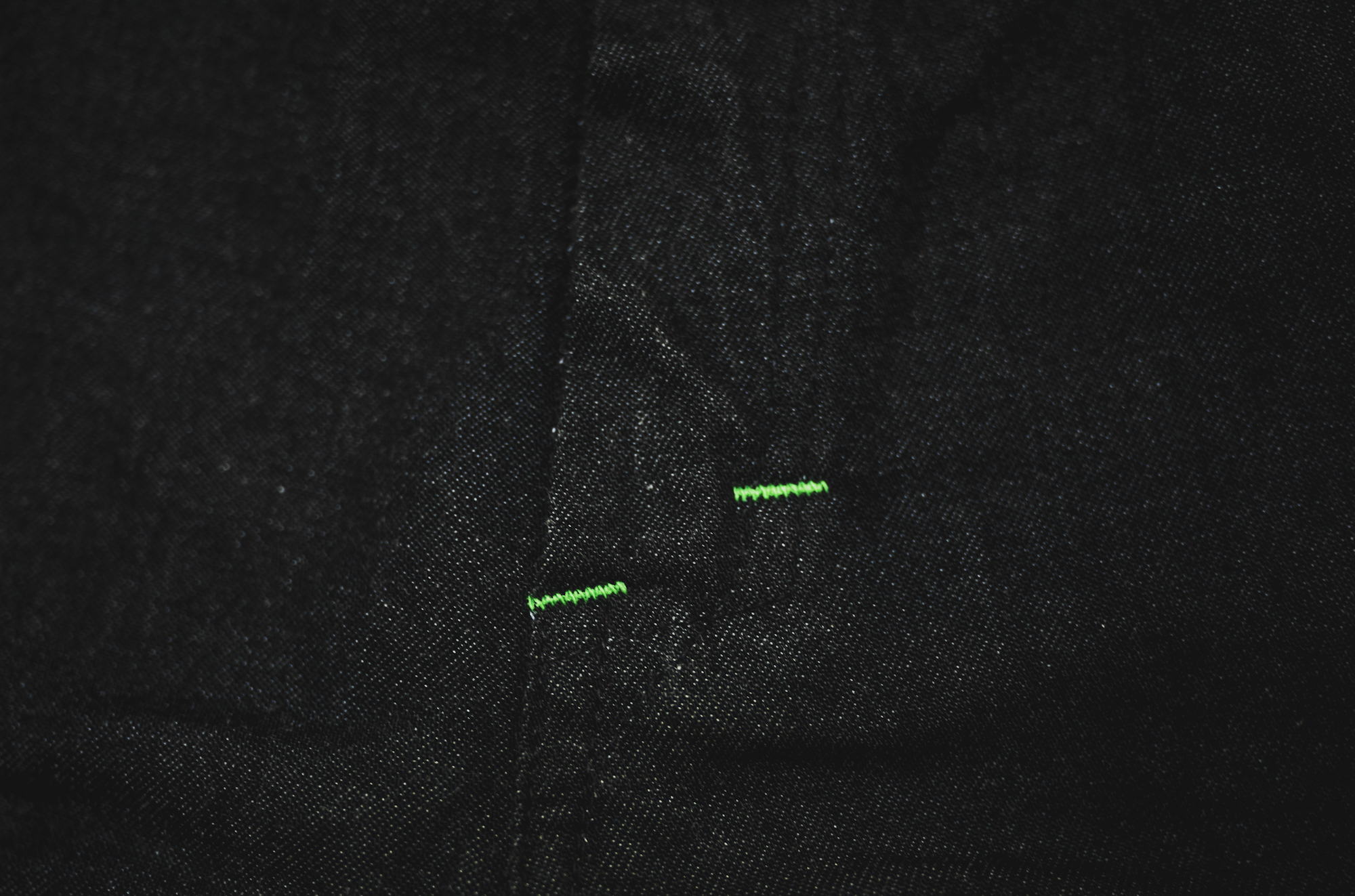
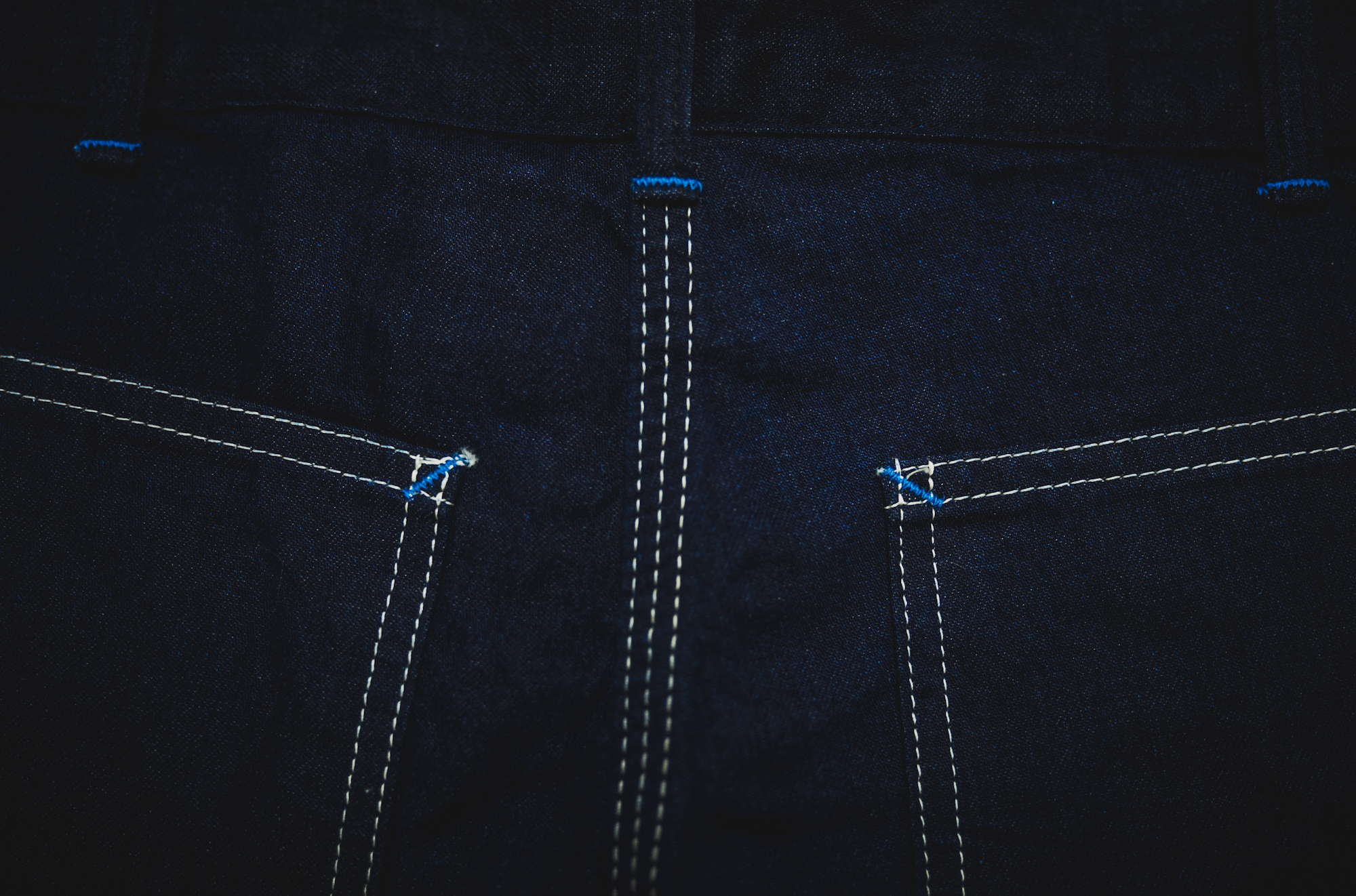
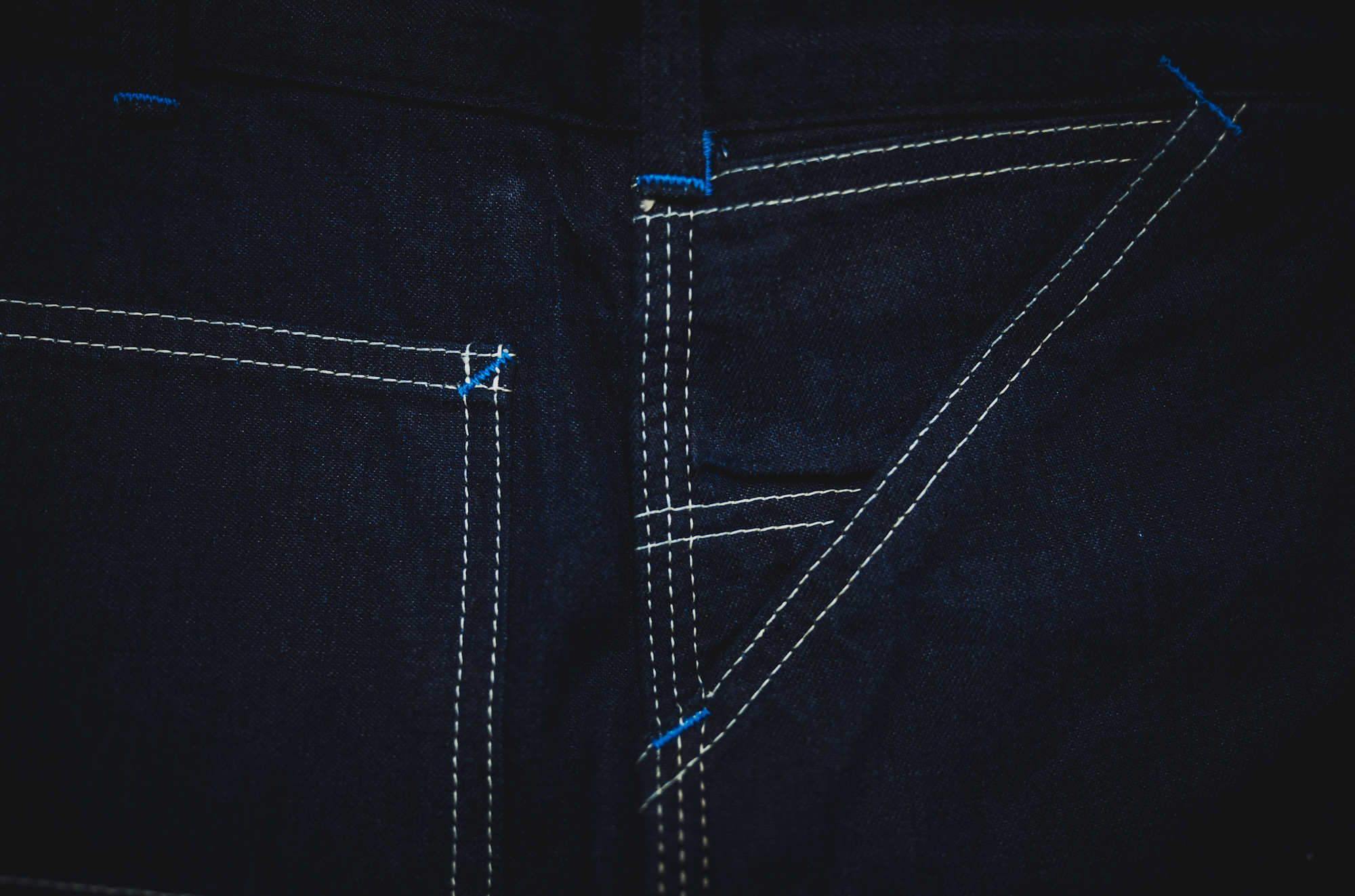
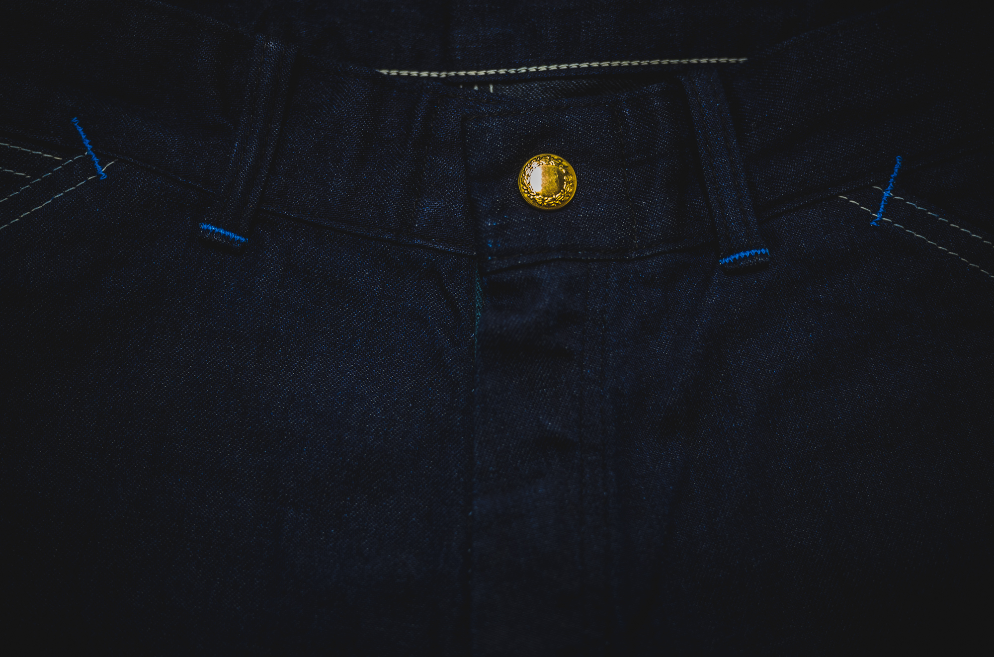
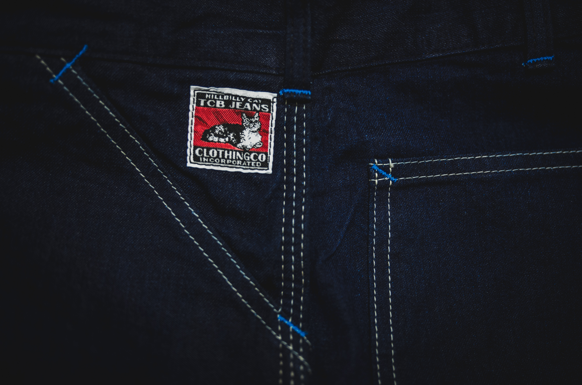
1930年頃のワークウェアに見られる、 あのカラフルなバータックが、昔から好きです。
あれは、いったい何のためだったのでしょうか。
補強していることを、ひと目で伝えるためだったのか。
各社のコーポレートカラーを、さりげなく忍ばせるためだったのか。
それとも、ただの“デザイン”だったのか。
でも、今こうして見返してみると、 それが現代において「デザイン」になっているのは、 間違いないように思います。
おそらく当時は、生産都合だったのでしょう。
バータックの設定を広めに取り、 さまざまな箇所をまとめて縫っていたからこそ、 場所によっては、少し大きくなってしまった。 その、too much な色。
その、too much な大きさ。 今の私には、そこがたまらなく魅力的に映ります。
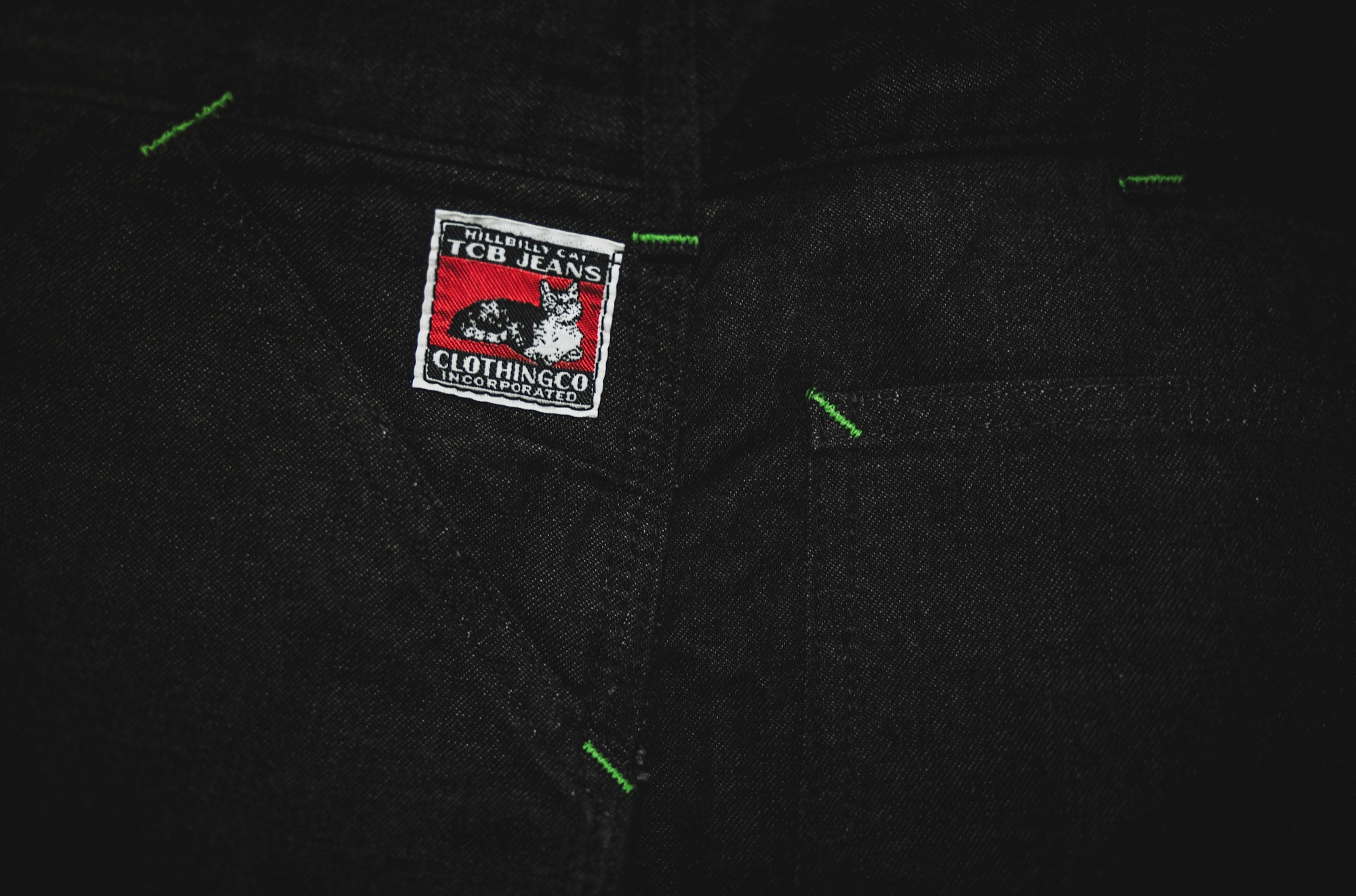
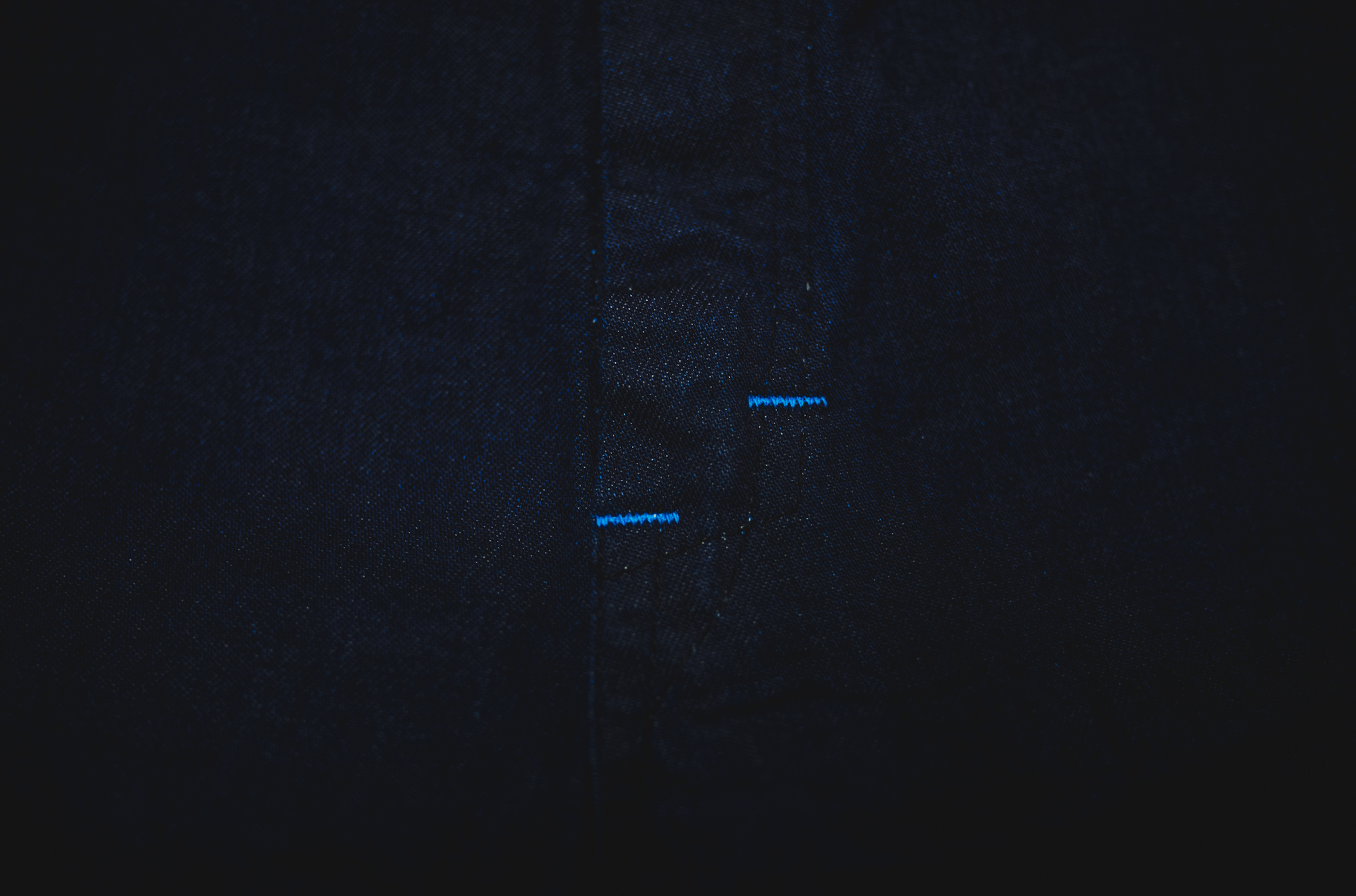
黒い生地の上で、 ネオンのように浮かび上がるグリーンのステッチ。
あれには、どうしても抗えません。
I have always loved the colorful bartacks found on workwear from around the 1930s.
What were they really for?
Were they meant to make the reinforcements instantly visible?
Were they subtle expressions of each company’s corporate colors?
Or were they simply there as decoration?
Looking at them now,
there is no doubt that they have become “design” in the modern sense.
Back then, however, they were probably a matter of production efficiency.
By setting the bartack width generously and stitching many areas at once,
some of them inevitably ended up slightly oversized, depending on the location.
Those too-much colors.
That too-much size.
Today, that excess is exactly what makes them so appealing to me.
On black fabric,
the green stitches glow almost like neon.
I simply can’t resist them.